
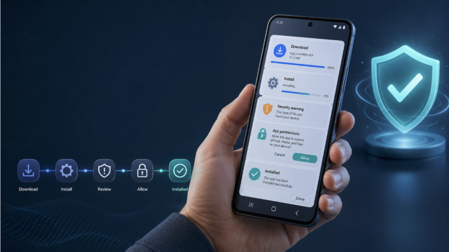
Installing an APK looks simple. A user taps Download, opens a file, and approves the install. Yet each step asks the user to make a judgment.
An app store works like a guarded shop. It checks the entrance, labels each product, and gives buyers a clear route back. A direct APK download removes that frame. The user must judge the website, the file, and the app without the same support.
This changes the main question. The user no longer asks only, “Do I want this app?” They also ask, “Is this file safe?” “Why does my phone show a warning?” “What access will the app need?”
Trust does not come from one logo or claim. It forms through a chain of small proofs. A clear page, a known source, and simple instructions can keep that chain intact.
Why APK Installation Feels Different
An APK asks users to leave the usual path. They do not tap a familiar app store button. They download a file, change a phone setting, and approve the installation themselves.
Each extra step creates doubt. A warning screen can feel like a locked gate. The user may stop even when the file comes from a valid source.
Clear guidance reduces that fear. A page built around a direct task, such as the bc game download guide, can explain what the file does, where it comes from, and how to install it. This context gives the user a map before the trip begins.
Trust grows when each step matches the last. The file name should match the app. The page should explain the required permissions. The install guide should use plain words.
Users feel safer when they know what will happen next. A predictable process gives them a sense of control.
The Trust Signals Users Notice First
Users scan before they read. They look for fast proof that the page, file, and app belong together.
A clear domain helps. So does a visible app name, a current version number, and a short install guide. These details act like labels on a sealed package. They do not prove safety on their own, but they reduce doubt.
Weak pages hide key facts. They use vague buttons, missing dates, or unclear file names. Strong pages show what the user will download and what will happen after the tap.
Trust grows when the page answers questions before the phone raises them. The user should not need to search for basic facts.
How Warning Screens Shape Risk
Android warnings protect users, but they also raise fear. A message about an “unknown source” can make a valid file feel unsafe.
The words matter. Users often treat warnings as verdicts rather than prompts. They may not know that the phone reacts to the source of the download, not to the actual content of the app.
“A warning does not always mean danger. It often means the user must make the final choice.”
A clear install page should explain why the warning appears. It should also show the exact setting the user may need to change. This keeps the user from guessing or opening the wrong menu.
The page should not offer false comfort. It should never suggest that every APK is safe. Instead, it should tell users to check the domain, file name, version, and requested permissions.
Clear context turns alarm into caution. The user stays alert without feeling lost.
Why Simple Steps Build Confidence

A long install process feels risky. A short process feels controlled. Users trust a page more when each action has one clear purpose.
Good instructions should:
Name the file before the user downloads it.
Show the file size so the user can spot an incomplete download.
Explain each permission in plain English.
Use numbered steps in the right order.
Describe warning screens before they appear.
Show how to cancel the process at any stage.
Explain how to update or remove the app later.
These details reduce mental effort. The user does not need to guess what comes next.
A clear process works like signs in an airport. Each sign answers one question. Where should I go? What should I open? What should I expect?
Instructions should also describe the result of each action. “Open the file” is less useful than “Open the file to start the Android installer.” The second version tells the user both what to do and why.
When instructions remove doubt, users move forward with more confidence.
Why Brand Consistency Reduces Doubt
Users trust a download more when the brand stays consistent at every step.
The domain, logo, app name, and support pages should match. A sudden change in design or tone can feel like a wrong turn. It may cause users to close the page even when the file is valid.
A clear route from the main bcgame platform to its app page helps users confirm that both pages belong to the same service. This link between pages acts like a marked path inside a large building. The user knows where they started and where they arrived.
Small details also matter. The same colors, terms, account options, and support language should appear across the website and app.
Consistency does not prove safety. It does, however, make copied pages and false downloads easier to spot. When one page looks or sounds different, the user has a reason to pause.
Conclusion
APK installation is not just a technical act. It is a test of trust.
Users judge the page, file, warnings, and brand as one chain. A weak link can stop the process. A clear file name, simple steps, honest permission notes, and steady design can keep that chain intact.
The best install pages do not push users past doubt. They remove the cause of doubt. They explain what will happen, why it will happen, and how the user can stay in control.
That is the core lesson. People trust APK files when the path feels clear, the source feels known, and each step matches what they expected.